During the design process, we need to decide on the extent of foil stamping. When crafting a design specifically for foil stamping, there are unique considerations compared to regular print design. Should the entire image be created using foil, or should foil just accentuate certain sections? In other words, do we want foil stamping to be the star of the show, or just an enhancer? This decision will dictate our design approach, as each option highlights the foil differently—either as the centerpiece or as a subtle enhancement.
#03
ROKKAKU StoryThe Road to a Single Stamp Vol. 1
〈Designs made possible by foil stamping〉
Stamping with foil
Just like that, foil stamping embellishes the surface of paper with a textured imprint and glossy finish, a feat regular ink printing cannot achieve. Yet, before this final stage, the "foil stamping" process involves several critical steps: design, foil selection, die production, and press setup.
What process is pivotal in bringing out the foil’s full brilliance and enhancing the design with vibrant colors?
Let’s delve into the intricate and painstaking journey that culminates in the creation of a lustrous finished product.
ー
The journey begins with the design phase, where the concept of the foil stamped image is born. Here, lies the crucial question: How do we craft a design that fully leverages the capabilities of foil stamping?
Index
-
01
Create the entire image with foil, or use it on just parts of the image
-
02
Choose a motif that works well with foil stamping
-
03
Use gimmicks and negative space to maximize limited colors
-
04
Pay special attention to details that invite a closer look
-
05
Add depth and texture to flat surfaces
-
06
COMMENT
Create the entire image with foil, or use it on just parts of the image
Choose a motif that works well with foil stamping
The first thing to consider when creating a design is: “What are we going to draw”?
Although any image can be enhanced by foil stamping, selecting a motif that looks exceptionally striking when foil stamped is crucial.
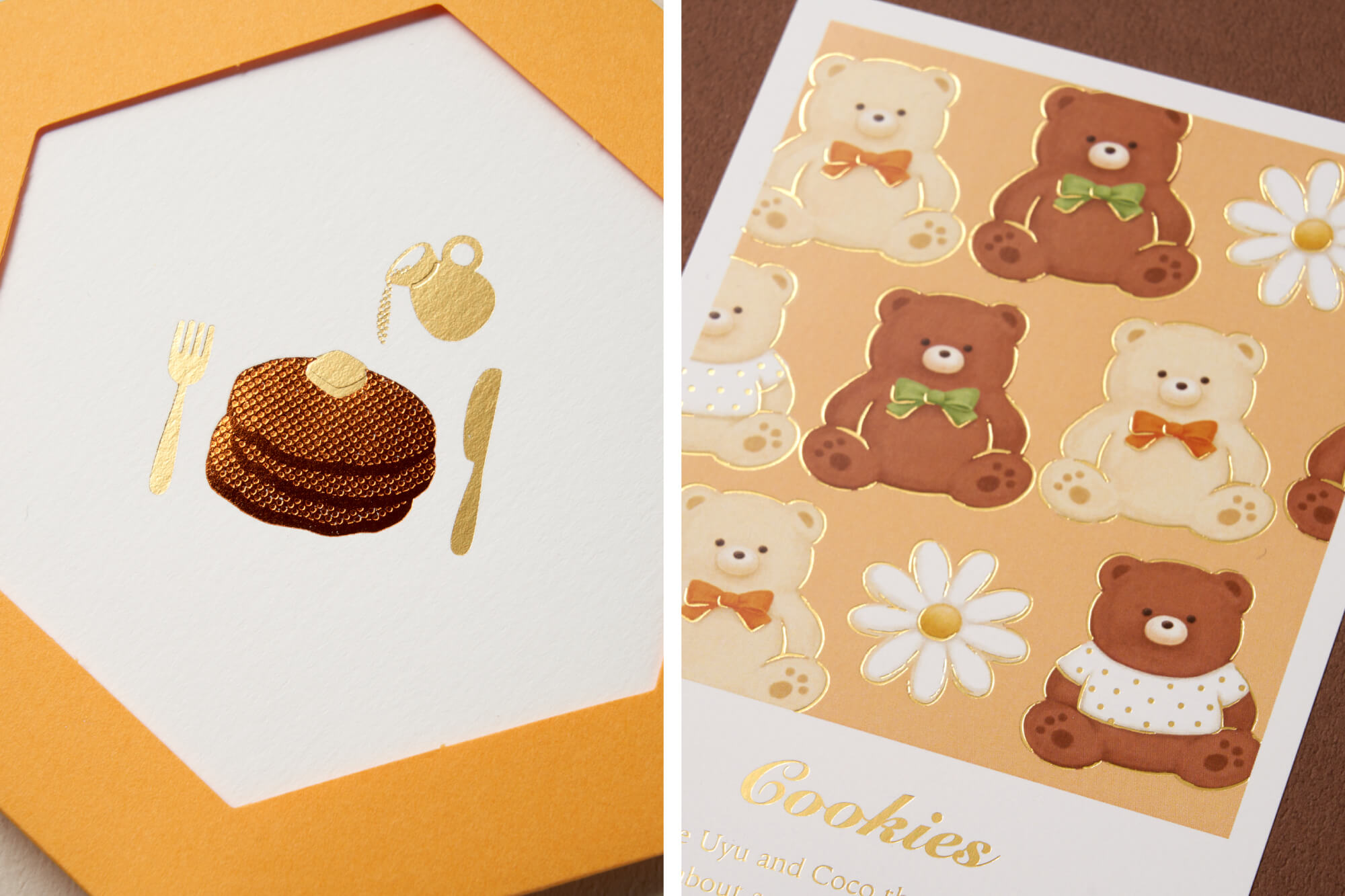
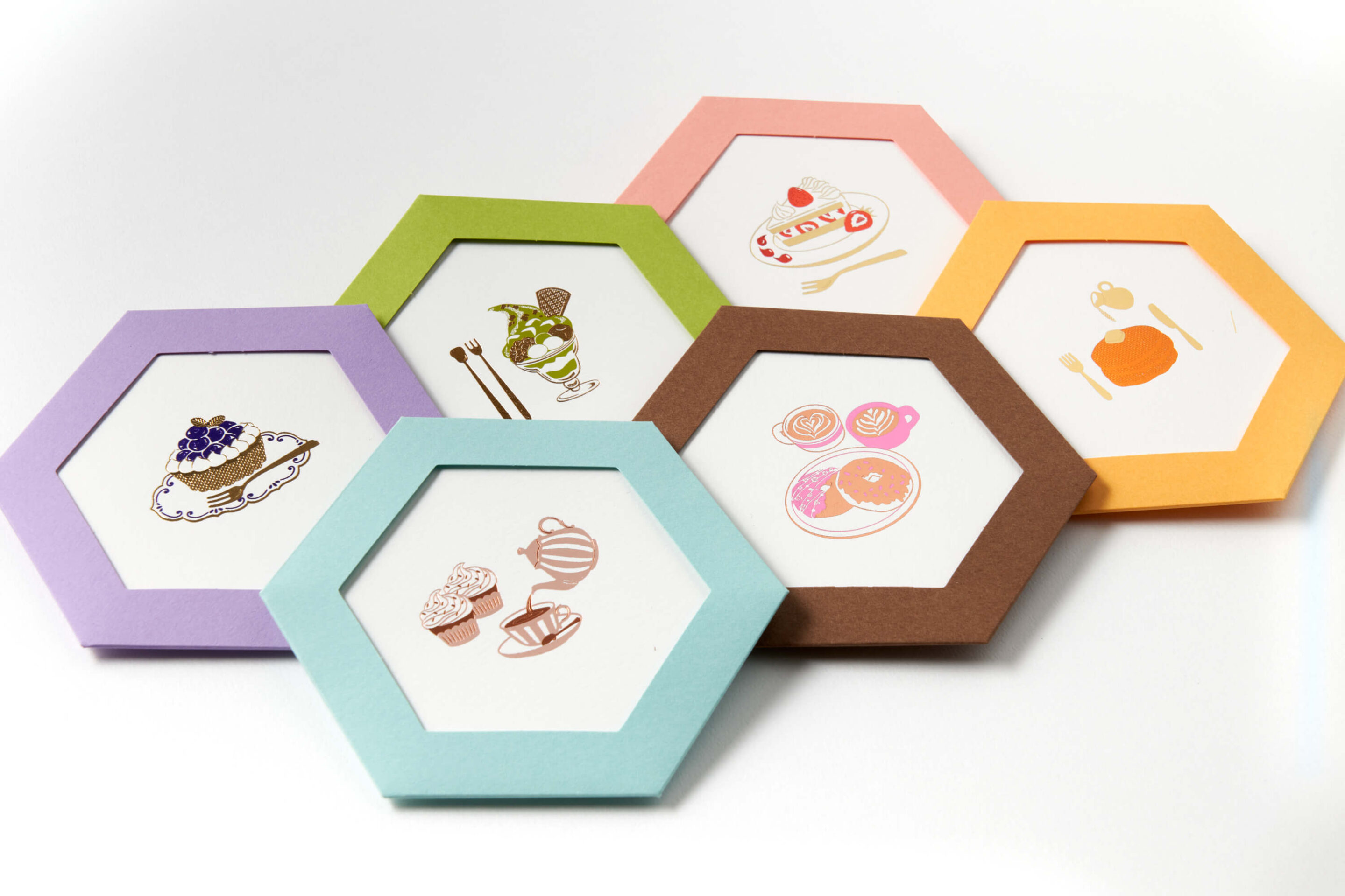
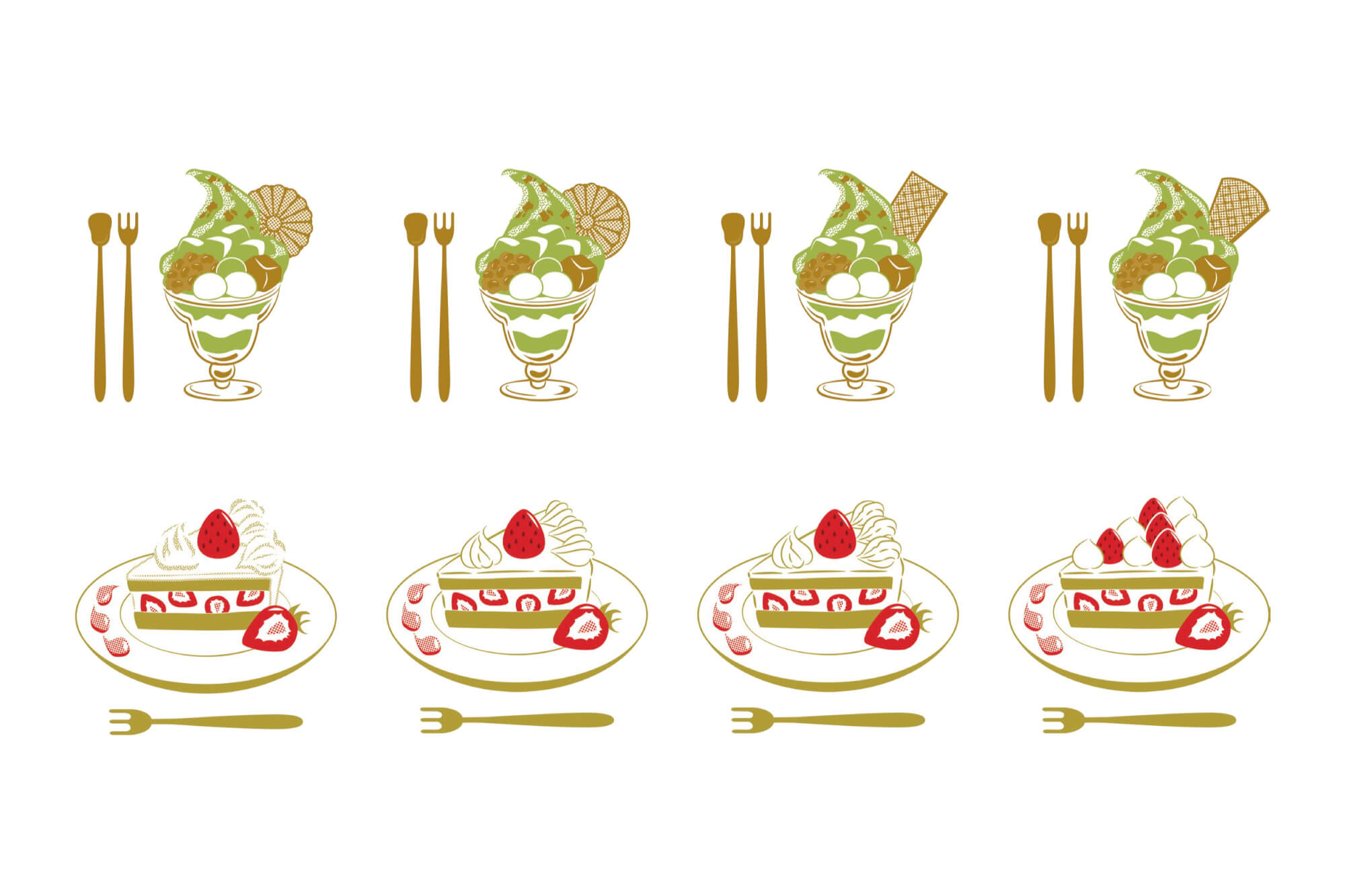
At ROKKAKU, we often choose traditional patterns and lucky symbols, which are popular motifs for foil stamping. However, we also like to incorporate everyday objects and landscapes into our designs. By featuring motifs that capture the joy of delectable sweets and seasonal vistas, our designs celebrate the beauty found in daily life.
Use gimmicks and negative space to maximize limited colors
Once the motif is set, we turn our focus to how foil stamping can enhance the design. While we aim to maximize the foil’s potential, we also have to consider its limitations.
One key limitation is the range of foil colors available. Due to technical constraints, designs typically incorporate one to three foil colors. Despite this limitation, we can broaden our expressive range by integrating texture. Techniques like dotting and hatching allow us to add shading and depth, even with a single color of foil, creating a three-dimensional effect. These color constraints challenge us to infuse creativity and intricate details throughout the design.
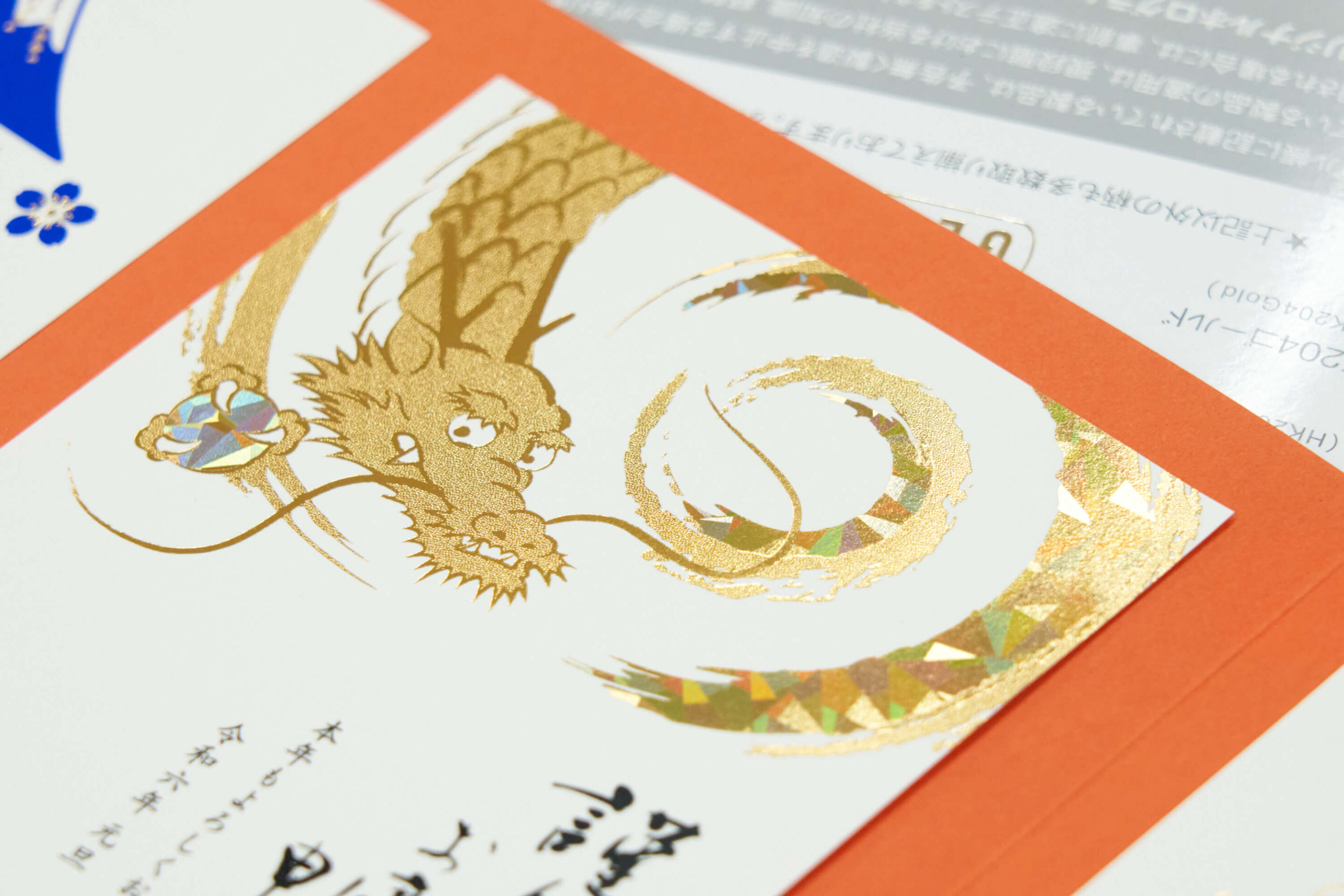 Only two colors of foil, gold and holographic gold, were used to create this dragon. We added a fine texture to enhance the lighter gold areas.
Negative space plays a crucial role in enhancing the impact of foil stamping. It involves the strategic placement of foil, the textured areas, and the portions left untouched, all contributing to the overall composition of the image. For instance, in the example below, only two colors—purple and gold—are used. By omitting foil from the cream atop the cake and the plate, the paper’s natural color comes into play, highlighting these elements without the addition of extra colors. This technique of using the paper as an expressive element is a distinctive feature of foil stamping.
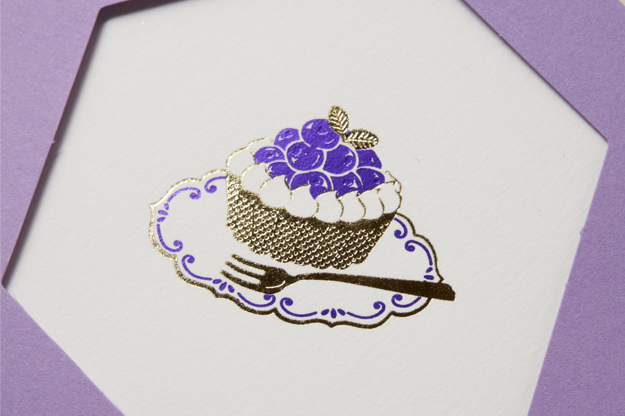 To capture the glossy texture of the fruit, foil is selectively omitted from the blueberries, allowing their natural sheen to be emphasized by the contrast.
Pay special attention to details that invite a closer look
Utilizing negative space and texture, we meticulously refine the image to enhance its beauty and maximize the visual appeal of foil stamping. We delve into each motif to decide on the best patterns and textures: Should the wafer accompanying the parfait be smooth or emulate a waffle texture? What form should the whipped cream on the shortcake take when gold stamped to ensure it looks its best?
 Every element, no matter how small, is considered by experimenting with various patterns.
Adding a touch of humor to the details allows those who examine the image closely to appreciate the nuances of the foil and the creative use of color.
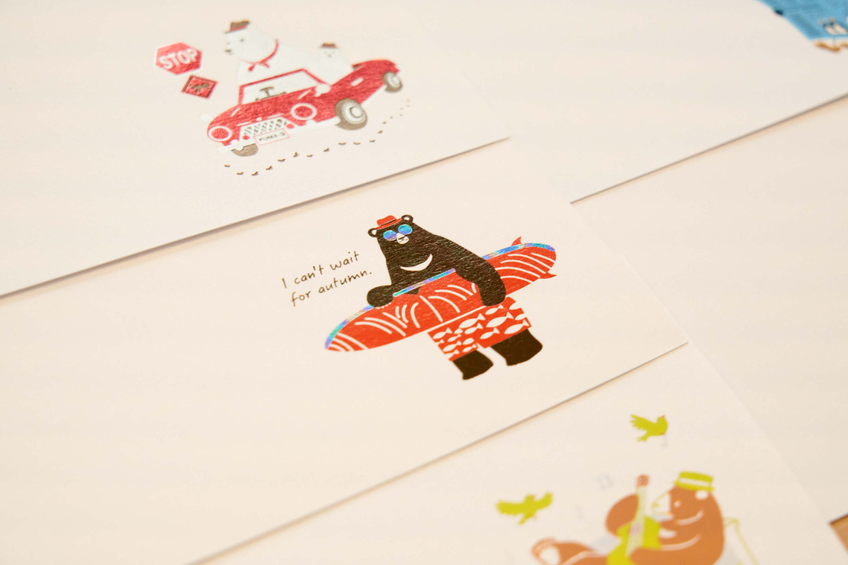 The surfboard held by the bear is cleverly designed to resemble a salmon fillet, complete with rainbow foil to mimic the fish’s iridescent skin.
Add depth and texture to flat surfaces
When designing an image that incorporates foil stamping in select areas, it’s important to consider how the foil can enhance the base design’s appeal.
 In this instance, we've used only a single shade of gold foil. The choice of foil lends a luxurious feel to the charming illustration.
Foil stamping can be employed in simple ways, such as outlining elements of the image or adding subtle accents. These touches, no matter how minor, bring depth and texture to what would otherwise be a flat visual. Foil stamping excels in adding dimension while keeping the use of colors and coverage minimal, ensuring the image remains uncluttered.
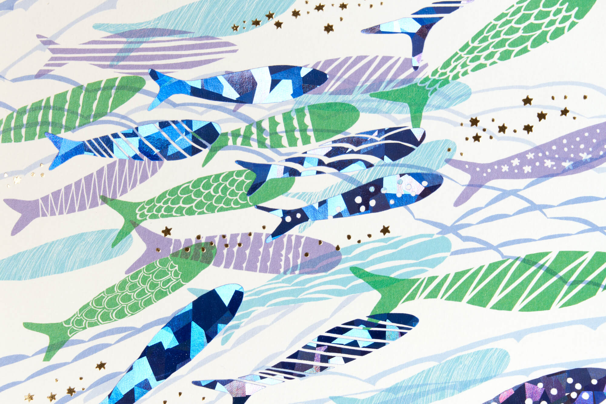 Applying foil stamping to a watercolor image with light and dark shades enhances the underwater illusion, creating a dynamic visual effect.
The true beauty of foil stamping lies in its ability to produce striking, glamorous effects with precise subtlety. Whether it’s the main feature or a supplementary enhancement, foil stamping captivates the viewer from the moment they engage with the piece. The art of design here is to fully harness the potential of foil stamping, focusing on every detail like line thickness, texture, and coverage, which then informs the foil selection and pressing process.
COMMENT
We’ve gathered insights from our designers, who engage daily in crafting intricate designs.

—— What is important to you in designing an image for foil stamping?
“Texture plays a crucial role in the allure of foil stamping. I gather photos and other materials to serve as references for my designs. For instance, when designing with a theme of sweets, I consider how best to use foil stamping to capture the three-dimensional twists of soft-serve ice cream or the embellishments on donuts, all while making comparisons to the actual items. My goal is to push the boundaries of what foil stamping can achieve, striving to create the richest texture and depth possible.”

——When do you feel the most joy as a designer?
“The possibilities with foil stamping are endless, which means I’m constantly exploring new techniques in each project. This aspect of design is particularly enjoyable because it not only utilizes my existing skills but also pushes me to experiment with new forms of expression. There are many subtle nuances in the design that might go unnoticed unless you look closely, but these details are crucial to the overall impact. Seeing a project come together flawlessly, without any compromises, brings me immense joy.”

——What do you think is the appeal of foil design?
“Foil isn’t just visually striking on its own; its beauty is enhanced when integrated into a design. The charm of foil lies in its dual ability to stand out as the centerpiece or to serve as a subtle enhancement. This versatility expands our creative possibilities and consistently presents new challenges.”